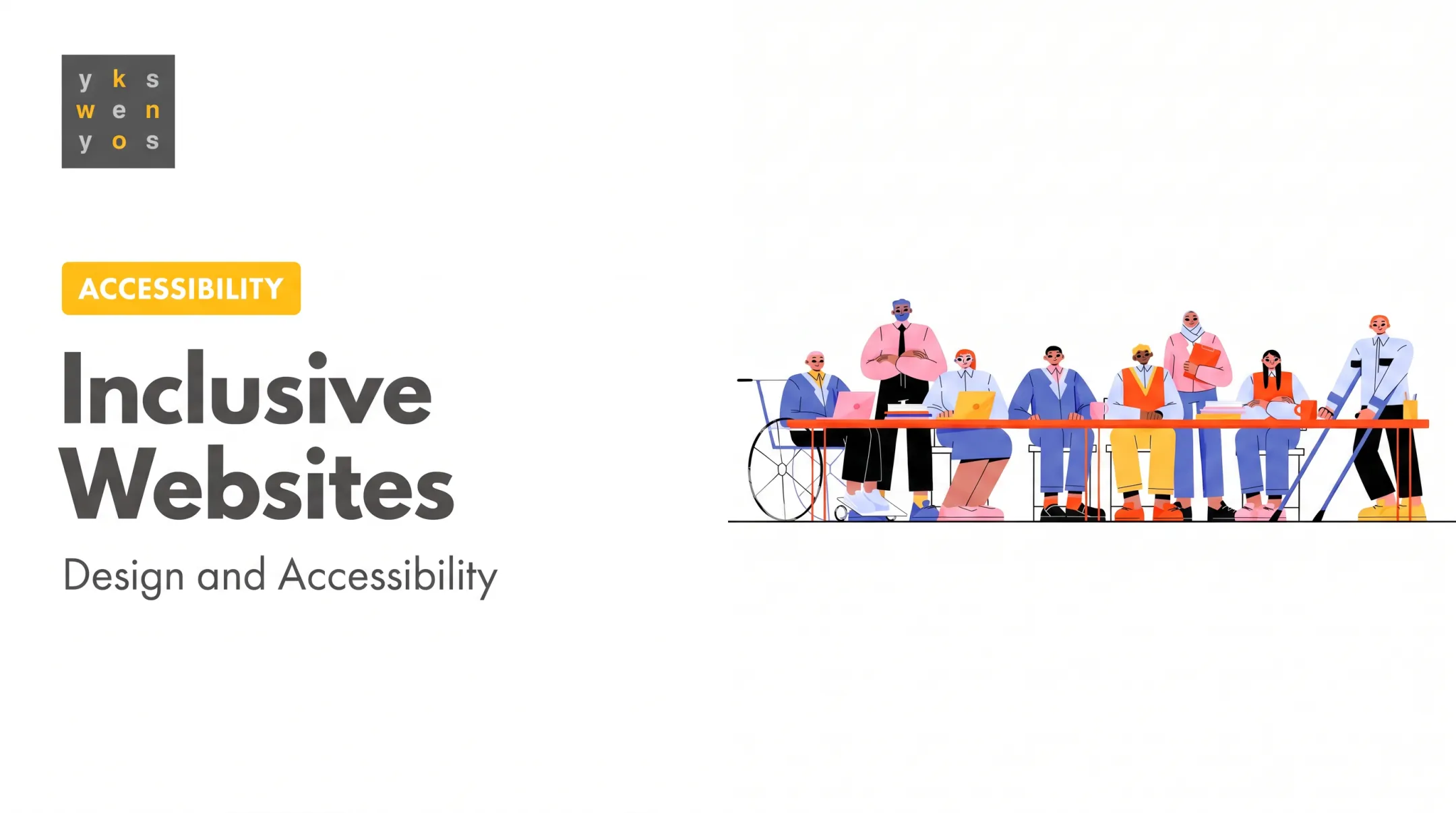
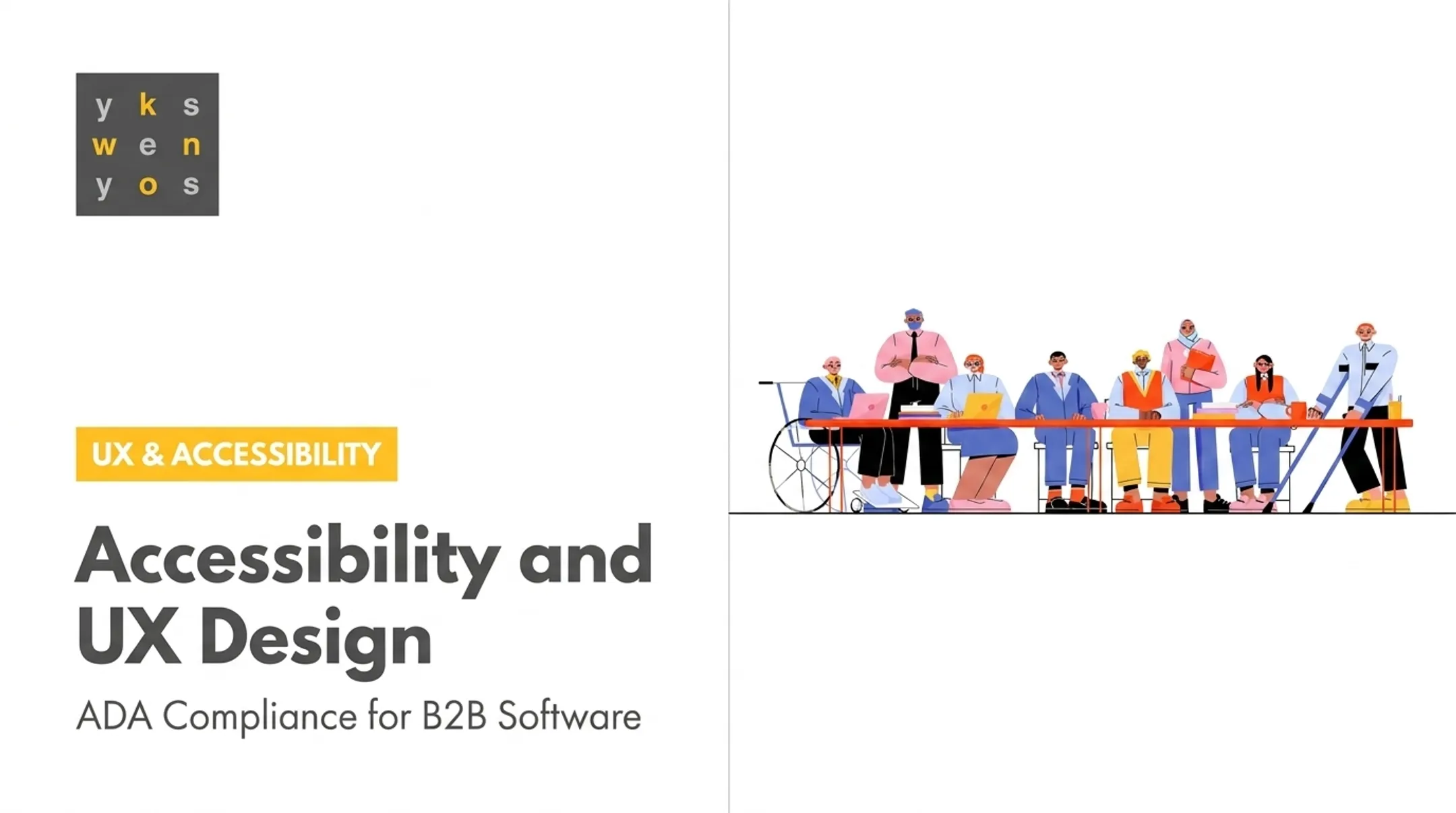
This guide is for designers working on websites, mobile products, and complex B2B software. Your users include people with permanent, temporary, and situational disabilities, whether they're using a screen reader every day or typing one-handed because they're holding a coffee.
We'll cover why accessibility matters, the WCAG principles that guide good decisions, practical interface patterns, how to build accessibility into your workflow, and how to test what you've built.
Key Takeaways
- Accessibility barriers block task completion in dense SaaS dashboards, forms, and financial workflows, not just marketing pages
- WCAG's four principles (Perceivable, Operable, Understandable, and Robust) give designers a decision-making framework
- Contrast ratios, touch-target sizing, and focus states have specific WCAG 2.2 thresholds designers can apply directly
- Automated scans catch some issues but miss most real barriers; manual and assistive-technology testing find the rest
- Shared ownership across design, content, engineering, and QA prevents accessibility from becoming one person's job
Why Accessibility Matters in Product Design
Inaccessible design blocks people from perceiving information, completing tasks, or making informed decisions. In a dense SaaS dashboard, that might mean a color-only status indicator a colorblind analyst can't distinguish. In a financial workflow, it might mean a form error message that disappears before a screen reader announces it.
According to the CDC's 2024 data release, more than one in four U.S. adults—over 70 million people—reported having a disability. Globally, the World Health Organization estimates 1.3 billion people experience significant disability. These figures come from different populations and definitions, so treat them as separate data points, not interchangeable statistics.

Accessibility Connects to Broader Product Outcomes
Accessible design tends to produce:
- Clearer workflows for all users, not just those using assistive technology
- Fewer usability barriers that slow down task completion
- Stronger readiness for procurement processes that require a VPAT or WCAG conformance
- Less late-stage rework—fixing a missing label pre-launch costs far less than retrofitting it after launch
Those product gains matter, but so does risk. Accessibility compliance is often a contractual requirement for companies serving government agencies or educational institutions under ADA guidelines, and getting it wrong has real consequences.
In 2014, the Department of Justice intervened in a case between the National Federation of the Blind and H&R Block, whose website and mobile app were inaccessible to people with visual, hearing, and physical disabilities. H&R Block agreed to a consent decree and $100,000 in damages.
Accessibility, Usability, and Inclusive Design Aren't the Same Thing
Clear outcomes also depend on clear language. These terms get used interchangeably, and that causes confusion:
- Accessibility removes barriers for disabled users and assistive technology users, measured against standards like WCAG
- Usability concerns overall user-friendliness and effectiveness for any user, without requiring adherence to specific regulations
- Inclusive design considers a wider range of identities, contexts, and situations, including connectivity, literacy, and economic circumstances
A product can pass a WCAG audit and still frustrate assistive technology users if nobody tested it with real people. Compliance and usability aren't the same achievement.
Accessibility Foundations: The POUR Principles
WCAG organizes accessibility around four principles, commonly abbreviated as POUR: Perceivable, Operable, Understandable, and Robust. Think of these as a decision-making framework, not a replacement for user research or professional judgment.
Perceivable
Users must be able to perceive the information you're presenting, regardless of sense or device. This means:
- Text alternatives for images, so screen readers can describe them
- Captions and transcripts for audio and video content
- Meaningful heading structure that doesn't rely on visual formatting alone
- Content that scales when users zoom or resize text
- Information that never depends on color alone (pair a red error state with an icon and text label)
Operable
Every interactive element must work without a mouse. That includes:
- Full keyboard access to all functionality
- Visible focus indicators that show where a keyboard user currently is
- Logical focus order that follows the visual layout
- Enough time to complete actions before a session times out
- Touch targets large enough to tap accurately, with alternatives to complex gestures like pinch-to-zoom
Understandable
Content and interactions need to behave predictably:
- Plain language instead of jargon
- Consistent navigation and component behavior across the product
- Descriptive labels ("Submit payment," not just "Submit")
- Error messages that explain the problem and how to fix it—without clearing the user's input
Robust
Your product needs to work with current and future browsers and assistive technologies. That means:
- Semantic HTML structure as the default
- ARIA only when native elements can't do the job
- Testing the implemented experience, not assuming a mockup will translate correctly

About the "Seven Pillars" of Accessibility
If you've searched for "seven pillars of accessibility," you may have found lists covering visual, auditory, motor, cognitive, speech, neurological, and age-related needs. That grouping is useful for thinking about user needs, but it isn't an official WCAG standard.
Different W3C resources group these needs differently—one names five categories, another names six. WCAG's actual structure is the four POUR principles above. Use the "seven pillars" framing to think about who you're designing for, but don't cite it as a formal WCAG requirement.
Designing for Different Needs, With Patterns You Can Apply
Different disabilities create different barriers, and the same interface change often helps more than one group.
Visual, Hearing, and Motor Considerations
- Visual: Prioritize contrast, resizable text, image alternatives, and a hierarchy screen readers can parse. Pair charts with text summaries—not color-coded legends alone.
- Hearing: Provide captions and visible status indicators instead of audio-only alerts.
- Motor: Support full keyboard access, generous touch targets, and alternatives to drag-and-drop or multi-finger gestures.
- Speech, cognitive, and neurological: Offer voice-input alternatives, predictable navigation, lower content density, and forgiving error handling.
Situational and Temporary Barriers Matter Too
Someone recovering from an eye injury, working in bright sunlight, or typing one-handed while holding a phone hits the same barriers as someone with a permanent disability. Fixes that help one group usually reduce friction for everyone else.
Test With Real Users, Not Just Simulations
Personas, simulations, and automated scans are useful starting points—they don't replace testing with people who use assistive technology daily. A self-run screen reader simulation won't match how an NVDA or VoiceOver user actually moves through your product.
Apply these color and content patterns directly:
- Verify text contrast at 4.5:1 minimum (3:1 for large text at 18pt or 14pt bold), per WCAG 2.2's Contrast (Minimum) criterion
- Set non-text UI elements, like button borders and icons, to at least 3:1 contrast against adjacent colors
- Size touch targets to at least 24 by 24 CSS pixels, per WCAG 2.2's Target Size (Minimum) criterion
- Design descriptive headings, meaningful link text ("View invoice #4521," not "Click here"), and predictable layouts
- Associate form labels with inputs directly, group related fields, and preserve entered data when validation fails
Accessible Data Tables and Dashboards
B2B products often live and die by their data. In Yes Yes Know's work on data-heavy B2B interfaces, clearer labels and layered complexity—not a full redesign—often unlock understanding. The same approach anchors accessible dashboards:
- Use proper header relationships in tables so screen readers can announce row and column context
- Provide a text summary or equivalent view alongside complex charts
- Support zoom and responsive layouts without breaking table structure
- Never convey a critical trend, like a security threat spike, through color alone
In cybersecurity products, where CISO and SOC analyst workflows hinge on spotting anomalies fast, these patterns decide whether an analyst catches a threat or misses it.
A Quick Design Review Checklist
Before you hand off a design, ask:
- Can every task be completed without a mouse?
- Does the content remain understandable without color or sound?
- Is focus always visible and does it follow a logical order?
- Has this been tested with someone who actually uses assistive technology?
Build Accessibility Into the Design Process
Accessibility works best when it starts on day one—not as a review after design is "done."
Start During Discovery and Research
Define who's affected, identify high-risk tasks, and review existing barriers before you sketch a single screen. Add accessibility questions to interviews, journey maps, personas, and usability studies. Yes Yes Know builds those questions into interviews, card sorting, and tree testing from the start instead of retrofitting them later.
When the firm redesigned Harvard Kennedy School's intranet, card sorting and tree testing surfaced real mental models and pain points. The team also worked directly with HKS's Accessibility team throughout.
Handoff documents compared desktop, tablet, and mobile layouts with numbered callouts for accessible headings and responsive requirements—detail a static mockup alone can't communicate.
Document Accessibility in Your Design System
Document accessibility once in the system so teams reuse it:
- Accessible component states (default, hover, focus, error, disabled)
- Keyboard interaction patterns for each component
- Content guidance and contrast requirements
- Known usage constraints
Hand Off With Annotations, Not Just Mockups
A static screen can't show focus order, motion preferences, or error handling. Annotate:
- Interaction states and semantic intent
- Responsive behavior across breakpoints
- Focus order and keyboard traps to avoid
- Anything that can't be inferred visually
Share Ownership Across the Team
Accessibility shouldn't sit with one specialist or get addressed right before launch. Product, design, content, engineering, and QA all influence outcomes. Automated checks can support testing, but research, strategy, and high-stakes calls still need human judgment.
Automated tools help, but they don't replace manual work. They catch issues like missing alt attributes and miss most real barriers. Manual keyboard checks, screen-reader testing, and zoom/reflow checks still matter.
On a complex B2B product, an outside accessibility audit and research-led UX review—like those Yes Yes Know runs—can surface barriers and prioritize remediation before implementation, not after.
Testing, Measuring, and Maintaining Accessible Experiences
A practical testing sequence looks like this:
- Review designs against WCAG guidance before development starts
- Run automated tools on the implemented product to catch obvious issues
- Complete keyboard testing, tabbing through every interactive element
- Test with screen readers and zoom, using tools like NVDA or VoiceOver
- Validate key tasks with people with disabilities, not just internal staff
Yes Yes Know's flat-fee accessibility audit follows this structure: automated tooling plus manual screen-reader testing, keyboard navigation review, and usability testing with assistive technology users.
Findings map to the specific WCAG 2.2 criterion violated and get a severity rating of critical, serious, moderate, or minor. Reports are delivered within 10 business days.

Prioritize by Impact, Not Just Volume
Not every finding deserves the same urgency. Weigh:
- Whether the barrier prevents task completion entirely
- How frequently the affected flow is used
- Which technologies or user groups are affected
- How much effort remediation requires
Legal and Procurement Context (Not Legal Advice)
Accessibility ties to real legal frameworks in the U.S. The ADA, signed into law in 1990, underpins much of today’s digital accessibility litigation.
More than 700 lawsuits were filed in 2023 against businesses for failing digital accessibility standards, about a quarter targeting companies sued before. Government agencies and educational institutions often require a VPAT (Voluntary Product Accessibility Template) in procurement.
None of this is legal advice. Your obligations depend on your organization, audience, and applicable law, so consult counsel for your situation.
Measure Progress Beyond a Single Score
Track progress across a few concrete signals:
- Resolved critical barriers
- Successful task completion rates
- Reduction in repeat defects
- Design system component adoption
- Direct user feedback
A single accessibility score rarely tells the whole story.
Make Accessibility Part of Good Design
Accessible design combines standards, empathy, evidence, and implementation discipline. A one-time contrast check before launch is not enough.
This week, pick one critical user flow in your product and:
- Review it against WCAG and real user needs
- Test the current experience with a keyboard and a screen reader
- Build a prioritized remediation plan from what you find
If your team needs research-led support to get there, Yes Yes Know works with B2B software companies on exactly this kind of accessibility and product design work.
Frequently Asked Questions
What is design accessibility?
Design accessibility means creating digital products that people with disabilities can perceive, understand, navigate, and operate, including through assistive technologies like screen readers and keyboard-only navigation.
What are the 7 pillars of accessibility?
"Seven pillars" isn't the formal WCAG structure. It's an informal label for user needs (visual, auditory, motor, cognitive, speech, neurological, and age-related) that map to WCAG's four principles: Perceivable, Operable, Understandable, and Robust.
What are examples of accessible design?
Examples include keyboard-friendly navigation, visible focus indicators, purposeful alt text, video captions, sufficient color contrast, clearly labeled forms, and error messages that preserve user input while explaining how to fix the problem.
How do designers test accessibility?
Designers combine design review against WCAG, automated scans, manual keyboard testing, screen-reader and zoom testing, and validation with people who actually use assistive technology daily.
Is accessibility only the responsibility of developers?
No. Accessibility is shared across research, product, design, content, engineering, QA, and leadership. Designers influence many barriers, like contrast, labeling, and focus order, long before a developer writes any code.