Content design often gets treated like a final polish step, something a copywriter does after the wireframes are locked. That framing misses the point entirely. The real value shows up in everyday outcomes: faster task completion, fewer support tickets, stronger accessibility, and users who actually trust the product they're using.
This article breaks down what content design is, why it affects product and business performance, what happens when teams skip it, and how to start applying it without redesigning everything at once.
Key Takeaways
- Language, structure, research, and testing cut user confusion and friction in complex products
- Clearer interfaces, onboarding, forms, errors, and support journeys all depend on it
- Strong content design improves usability, accessibility, consistency, and product trust
- Cross-functional work with researchers, PMs, and developers multiplies the impact
- Start with an audit of one high-value user journey, not a full content overhaul
What Is Content Design?
Content design means shaping words, structure, and interactions around what a user needs to understand and do next. It links a feature to the person trying to use it.
You'll find content design decisions embedded in:
- Navigation labels and button text
- Onboarding flows and empty states
- Forms, notifications, and error messages
- Permissions screens and dashboards
- Help centers and marketing-to-product handoffs
How it differs from related disciplines
According to NN/g's comparison of content strategy and UX writing, three related roles sit close together but solve different problems:
- UX writing crafts concise, context-appropriate text that guides someone through an experience
- Content design structures and formats that content inside the broader information architecture, sometimes including content-inclusive wireframes
- Content strategy plans how content gets delivered and maintained across channels over time
These roles overlap in practice, but the distinction matters when you're building a team.
Content design isn't something bolted onto a finished interface. It starts with user intent and task requirements, then shapes language and structure to support the outcome the user came for.
Key Advantages of Content Design
The advantages below focus on operational outcomes, not abstract claims about "better copy." Each one connects to something measurable.
Advantage 1: Makes Complex Products Easier to Understand and Use
Technical products bury users in jargon, data-heavy screens, and workflows that assume prior expertise. Content design translates that complexity into language and structure people can actually act on.
Take a security alert or a permissions screen in a B2B analytics tool. Clear labels, logical grouping, and progressive disclosure (showing only what's needed at each step) reduce the mental effort required to figure out what to do next.
This isn't just about being "nice." NN/g's usability research on expert users found that even participants with science, technology, and medical expertise preferred succinct, scannable information over dense technical text. Expertise doesn't eliminate the need for clarity; it often raises the stakes when clarity is missing.
Why this matters:
- Clearer content reduces hesitation, misclicks, and repeated re-reading
- Fewer users need to ask a colleague or file a support ticket to understand a screen
- Products scale more easily across user groups with different technical backgrounds
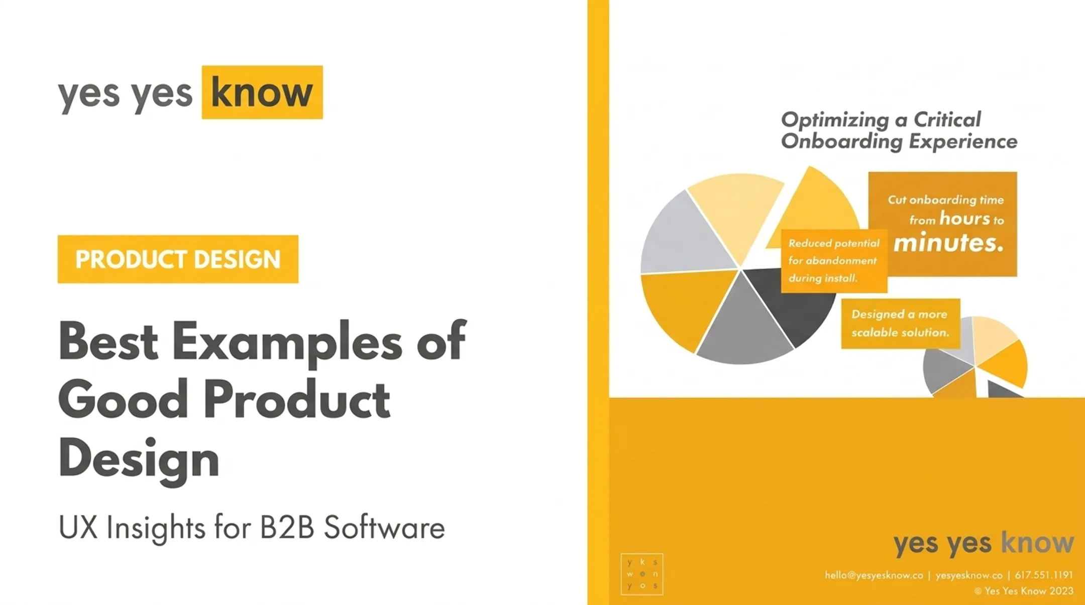
Yes Yes Know saw this play out with Starburst Data, a cloud analytics platform whose onboarding took roughly three hours. Usability testing and content restructuring cut that down to under three minutes. That kind of gap usually isn't a technology problem. It's a comprehension problem.

KPIs impacted: task completion rate, time on task, error rate, feature adoption, search success, and onboarding completion.
When it matters most: complex products, specialist workflows, regulated environments, new-user onboarding, and any product serving users with mixed technical fluency.
Advantage 2: Improves Accessibility and Inclusion
Clarity for complex products only holds if everyone can use that content. Accessible content means meaningful labels, clear instructions, understandable error messages, and logical heading structures that work with screen readers and other assistive technology. This isn't a final compliance checkbox; it needs to happen alongside interaction and visual design from the start.
The scale of the problem is bigger than most teams assume. WebAIM's 2026 audit of one million homepages found missing form-input labels on 51% of sites, with 33.1% of individual form inputs lacking proper labels. That's homepage data, not enterprise software, but it signals how common this failure mode is even on sites with dedicated design teams.
WCAG 2.2 lays out specific, testable requirements relevant to product forms:
- Labels or instructions are required wherever content needs user input (Level A)
- Error identification must describe detected input errors in text, not just color or icons (Level A)
- Error suggestions should offer correction guidance when the fix is known, with limited exceptions (Level AA)
Accessible content also helps everyone, not just users with disabilities. Someone on a mobile device, working under time pressure, or unfamiliar with your product benefits from the same clarity.
Why this matters:
- Screen-reader and keyboard users can complete the same tasks as everyone else
- Clear labels and error text cut form failures for all users, not only assistive-tech users
- Teams get a prioritized remediation path instead of a vague punch list
Yes Yes Know's accessibility audits map issues to specific WCAG 2.2 criteria and rate severity as critical, serious, moderate, or minor, so teams know what to fix first.
KPIs impacted: accessibility issue severity, task and form completion, support requests, procurement readiness, and remediation effort.
When it matters most: public-sector and education products, enterprise procurement requiring VPATs, ADA/WCAG compliance obligations, and high-volume operational software.
Advantage 3: Creates Consistency, Trust, and Stronger Product Decisions
Once content is clear and accessible, consistency is what keeps trust intact across the product. Shared terminology and reusable content patterns help users experience a product as one coherent thing, not a patchwork of screens built by different teams at different times. When "customer" means one thing in marketing and something else in the product, users notice.
Content design also exposes broken product logic. If a feature can't be explained clearly, that's often a signal the underlying workflow, permissions model, or value proposition needs rework, not just better copy.
NN/g's research on content standards in design systems points to Adobe's Spectrum design system, which pairs UI component guidance with writing checklists for elements like password fields and help text. Shared standards like this reduce debate, late-stage content requests, and rework, though NN/g doesn't attach a specific dollar figure to those savings.
Why this matters:
- Users stop having to relearn concepts across different screens
- Product, design, engineering, and support teams make more aligned decisions
- Content rework and design debt drop as terminology stays consistent
KPIs impacted: terminology-related support tickets, content defects, design and development rework, conversion between journey stages, and retention.
When it matters most: growing SaaS companies, multi-product organizations, post-acquisition product ecosystems, and late-stage startups carrying design debt.
What Happens When Content Design Is Missing or Ignored
Teams often blame confusing products on visual design, slow load times, or "user error." The real cause is often content that was never structured around what users need.
Common consequences include:
- Confusing navigation and abandoned workflows
- Incomplete forms and preventable mistakes
- Low feature adoption because users don't understand what a feature does
- Inconsistent terminology across screens and support docs
- Rising support ticket volume for the same recurring confusion
- Accessibility barriers that block task completion entirely
These problems compound. Every new feature added without shared terminology or content ownership adds another inconsistent pattern for users to decode.
Harvard Kennedy School's intranet shows how this plays out. Its department-based structure required users to already know which department owned a resource just to find it. That single structural decision created ongoing frustration and made people question whether the content was trustworthy or current.
Yes Yes Know's redesign rebuilt navigation, added breadcrumbs and page overviews, and applied consistent templates. Less than two weeks of research was enough to diagnose the structural gaps.
Ambiguous microcopy creates the same kind of failure. An NN/g account describes an enterprise error message that referred to "missing files" when the real problem was incompatible software versions across the organization. The wording masked a coordination failure that had nothing to do with the interface itself.
Content design won't fix bad product strategy or weak engineering on its own. It is the layer that makes those other investments usable—and keeps recurring confusion from becoming the product's default state.

How to Get the Most Value from Content Design
Content design works best woven into discovery, research, development, and post-launch review, not squeezed in as a final copy pass before launch.
- Audit one high-value journey first. Pick something concrete: account setup, onboarding, reporting, checkout, or a core operational workflow. Document user goals, terminology gaps, error points, and handoffs between teams.
- Validate with real users, not assumptions. Use interviews, usability testing, support-ticket analysis, and accessibility evaluation to see where language actually breaks down.
- Build shared content patterns. Approved terminology, voice and tone guidance, error-message principles, and reading-level expectations reduce inconsistency as your product grows.
- Assign ownership. Someone needs to maintain these patterns as features, regulations, and user needs shift over time.
- Track signals after launch. Task completion, support volume, and accessibility outcomes tell you where to prioritize next.
Teams managing complex B2B software don't have to do this alone. Yes Yes Know works with data-heavy SaaS, cybersecurity, and fintech companies to audit workflows, validate content decisions with real users, and connect accessible content to product design and development.
In one onboarding engagement, that mix of research and content restructuring reduced installation abandonment and shortened setup time from hours to minutes.
Sustain a review loop that keeps pace with how the product actually changes.

Conclusion
Content design matters because it turns raw product information into something people can actually understand and act on. Its value goes well beyond better wording: it shapes clarity, consistency, user confidence, and maintainability as complex products scale.
Treat content design as an ongoing, research-informed practice rather than a one-time cleanup. Start with the user journey where confusion or failure costs you the most, whether that's onboarding, a compliance-heavy form, or a dashboard your support team keeps fielding tickets about.
Frequently Asked Questions
Is web design still worth it in 2026?
Yes, but only when it improves usability, accessibility, clarity, and business outcomes. NN/g's 2026 analysis notes that surface-level visual polish alone isn't enough. Strategic, user-centered design still drives results; purely aesthetic updates don't.
What does a content designer do?
Content designers research user needs, structure information architecture, write interface content, and collaborate with product teams throughout development. They also test language choices with real users to confirm terminology actually makes sense.
What are the 7 C's of website design?
The most commonly cited version, from the Rayport-Jaworski framework, lists context, content, community, customization, communication, connection, and commerce. An older list uses communication, comprehension, clarity, comfort, collaboration, creation, and cartography. The exact set varies by source.
How much does a website designer cost?
Cost depends on scope. Page count, functionality, research, accessibility work, content strategy, and ongoing support all factor in. Compare full deliverables across quotes rather than hourly rate alone.
What is the difference between content design and UX writing?
UX writing focuses primarily on crafting interface text: buttons, labels, and microcopy. Content design takes a broader systems view, covering structure, research, user journeys, accessibility, and reusable content patterns across a product.
How do you measure the impact of content design?
Track task completion rate, time on task, error rate, search success, support ticket volume, and accessibility outcomes. Choose metrics based on what the user journey is trying to accomplish.