Most product teams run into the same walls: workflows that feel like obstacle courses, navigation that hides what users need, feature bloat, sluggish onboarding, and interfaces that break down across roles, devices, or assistive technology. Add inconsistent experiences between admin and end-user views, and adoption suffers.
This guide covers the practical side of fixing that. We'll walk through core UX principles, a research-backed design process, accessibility fundamentals, validation methods, and how to measure whether your changes actually worked.
Key Takeaways
- Cognitive load, not visual polish, determines whether SaaS users stick with a product
- A research-led process (not internal assumptions) uncovers the real friction points
- Accessibility must be built in from discovery, not patched in after launch
- Measure UX by tying behavior data to business outcomes—not vanity metrics
- Role-based design stops the permission confusion that plagues B2B tools
What Makes SaaS UX Design Different?
SaaS UX design covers the entire lifecycle of using subscription-based, cloud-delivered software. That includes sign-up, onboarding, daily workflows, support interactions, upgrades, and everything that happens over months or years of use.
Unlike a one-time install, SaaS is a cloud-based delivery model where the provider manages infrastructure, security, and updates. The user relationship keeps running long after the first login, according to Microsoft Azure's definition of SaaS.
That ongoing relationship changes what "good design" means. A single confusing button matters less in software you use once. In software you open every day, that same friction compounds fast.
Repeated Use Raises the Bar
Consistency, speed, and recoverability start to matter more than novelty. Users build muscle memory. When a workflow shifts unexpectedly, they notice immediately, and often complain.
Pendo's benchmarking data shows the challenge clearly: the average SaaS product retains just 39% of users after one month, dropping to roughly 30% after three months, according to Pendo's 2025 retention benchmark report. Retention isn't purely a UX metric, but a product that's genuinely easy to keep using has a real advantage in that math.
SaaS Audiences Are Rarely One Persona
B2B SaaS products rarely serve one persona. A single interface has to support people with different permissions, goals, and technical fluency:
- Administrators configuring integrations
- Managers overseeing team activity
- Operators running daily workflows
- Analysts and specialists pulling reports
That's exactly the challenge Yes Yes Know ran into with Starburst Data's cloud platform. Onboarding required infrastructure prerequisites, multiple internal skill sets, approvals, and handoffs across the customer's organization. Complex audiences need workflows designed around actual roles, not a generic "user" persona.

SaaS UX also has to balance two audiences at once: the person doing the task and the business paying for the subscription. Product adoption, activation, support demand, retention, and expansion revenue all trace back, at least partly, to how the product feels to use.
B2B and enterprise products add more layers still:
- Data-dense screens
- Third-party integrations
- Approval chains and security requirements
- Workflows that span multiple products
None of that is optional to design around.
The Core Principles of Effective SaaS UX
Effective SaaS UX helps users finish meaningful work with less effort—not showcase every feature. That priority shapes almost every design decision that follows.
Reduce Cognitive Load First
Clear labels, familiar interaction patterns, and logical grouping reduce the mental tax of using software. Sensible defaults and progressive disclosure matter too: show a handful of important options up front, and reveal advanced settings only when someone asks for them.
Yes Yes Know's Junior UX Consultant Vivian Kuo puts it simply: good UX helps people think less, not more. In practice, that means:
- Surfacing essential data immediately, with details available a click away
- Using visual hierarchy to guide the eye to what matters most
- Grouping related actions instead of scattering them across menus
- Reserving progressive disclosure for genuinely advanced functionality
Onboard Toward a First Win, Not a Feature List
Tutorials that walk through every feature tend to interrupt users, don't reliably improve task performance, and get forgotten almost immediately, according to Nielsen Norman Group's research on onboarding tutorials. Contextual help, pulled in only when it's useful, performs better.
Center onboarding on one meaningful outcome. Starburst Data is the clearest proof point here: setup that once took three hours dropped to three minutes after usability testing and product strategy work reshaped the onboarding flow. That's the kind of "time to first value" number that actually predicts retention.
Structure Navigation Around Mental Models
Once users are in the product, navigation has to match how they already think about their work—not how your org chart is structured. In data-heavy SaaS, that often means organizing around jobs like "investigate an alert" or "export a report," not internal service names.
Validate labels and groupings with card sorting, tree testing, interviews, or observed task behavior instead of guessing.
Design for Role-Based Relevance
The same product rarely serves one job. An admin, an analyst, and a read-only stakeholder need different tools, data, and actions. Show each role what matches their responsibilities—and keep shared context visible when decisions depend on it.
Hiding essential information to "simplify" the interface usually creates permission confusion, not clarity.
Build in Feedback and Recovery
Every important interaction should leave users certain about what happened and what to do next. Build that certainty in with:
- Loading states and confirmations for irreversible or slow actions
- Inline validation and plain-language error messages
- Undo options and autosave so mistakes are cheap to fix

A Research-Led SaaS UX Design Process
Strong SaaS UX comes from a repeatable research process, not gut feel alone.
Start With Discovery
Before any design work, clarify business objectives, target customer segments, product constraints, and known support issues. Many teams start with a short audit of goals, team composition, and existing UX processes—the same entry point Yes Yes Know uses—to expand design capability without adding headcount.
Research How People Actually Work
Contextual inquiry—observing and interviewing users in their own environment—fits complex systems and multi-step workflows especially well, per NN/g's guidance on UX research methods. Pair it with:
- Product analytics and support-ticket review
- Surveys and structured interviews
- Card sorting and tree testing for navigation
- Diary or field studies for distributed or operational usage
Turn Research Into Artifacts
Raw findings only help once they become working artifacts: personas or role profiles, journey maps, task models, workflow diagrams, and a prioritized list of usability problems. Those artifacts keep research visible in design reviews instead of buried in slide decks.
Resolve Function Before Visual Polish
Sketch user flows and information architecture first. Move to low-fidelity wireframes and prototypes before touching high-fidelity visuals. Workflow problems are expensive to fix after visual design has locked things in place.
Validate Before and During Development
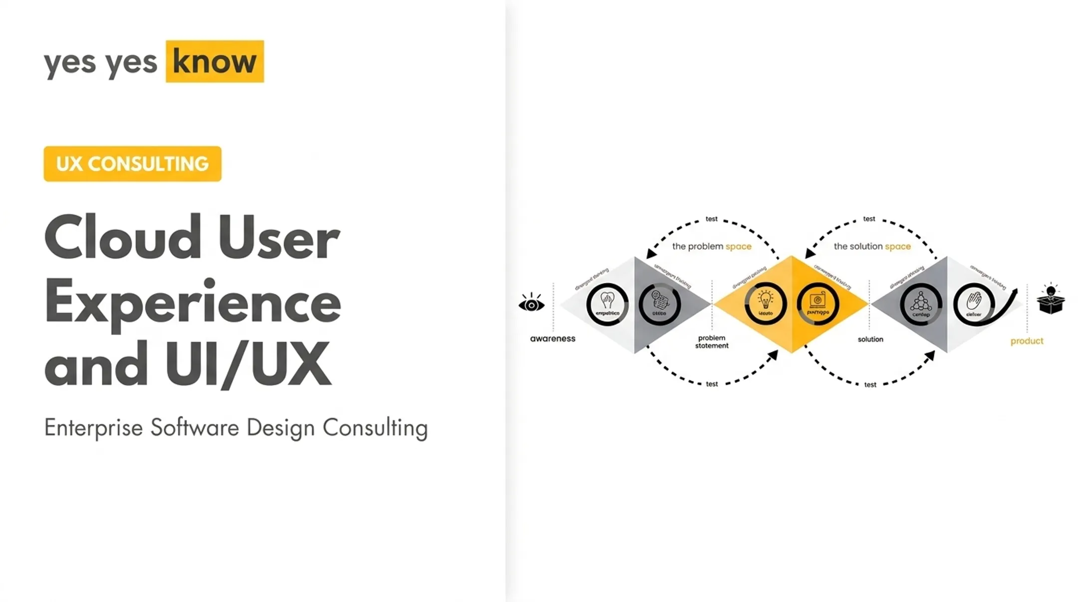
Moderated or unmoderated usability testing, prototype testing, accessibility checks, and structured stakeholder review all belong before launch—not after. A practical model is three iterative phases—Understanding, Designing, and Building—with accessibility checked at every stage rather than bolted on at the end. If your team lacks the bandwidth or distance to run this process, an outside UX partner can fill the gap. Yes Yes Know supports B2B SaaS teams across audit, research, design, validation, accessibility, and development collaboration when assumptions need a fresh challenge.
Designing for Complex, Accessible SaaS Workflows
Data-dense, multi-step workflows are where SaaS UX gets genuinely hard. Simplifying them without losing necessary detail takes deliberate structure.
Simplify Without Stripping Detail
Start by identifying the user's primary decision. Then prioritize the data that actually informs it, add filtering and sorting, and preserve context as users move through a task. Secondary information can wait, revealed progressively rather than dumped all at once.
Yes Yes Know saw this with Lakeside: research into which users needed which data—and when—led to a cleaner UI with clear labels and layered complexity instead of an overloaded interface.
Build Dashboards as Decision Tools
A dashboard isn't a gallery of charts. Every visualization, status indicator, and action should trace back to a real question a user actually asks. Bar charts handle quantitative comparison reliably; pie and donut charts generally don't communicate well for most decision-support tasks, according to NN/g's dashboard research. That same principle shaped Yes Yes Know's work with ThreatX, partnering with CISOs and SOC analysts to sharpen the UI security teams use to monitor threats in real time.

Handle Cross-System Workflows Consistently
When a task spans multiple products or steps, consistent terminology, visible status, and preserved progress keep users oriented. Clear handoffs and transparent system boundaries prevent the "did that actually save?" panic that erodes trust fast.
Make Accessibility Non-Negotiable
Accessibility belongs in discovery, not a pre-launch checklist. WCAG 2.2, the current W3C standard, requires meeting all Level A and AA success criteria for AA conformance, per W3C's WCAG 2.2 specification. That means covering:
- Keyboard navigation and visible focus order
- Semantic structure and proper form labels
- Color contrast and non-color status indicators
- Text alternatives, captions, and readable content
Automated scans catch some of this. They don't catch everything. Testing with people who actually use assistive technology, across different devices and connectivity conditions, finds problems automated tools miss entirely. Yes Yes Know's flat-fee Accessibility Audit pairs automated tools with manual testing, screen readers, and keyboard-only review. Results are evaluated against WCAG 2.2 AA and delivered within 10 business days.
Scale With Design Systems
As features and teams multiply, reusable components, documented patterns, and shared accessibility criteria keep the product consistent. Without them, every new feature reinvents its own conventions, and users pay the price in confusion.
Common SaaS UX Mistakes to Avoid
A few mistakes show up again and again in B2B SaaS products, regardless of industry.
- Designing around the feature list instead of user tasks: use jobs-to-be-done thinking to learn what users need to accomplish, then prioritize value-delivering workflows and keep advanced capabilities discoverable, not mandatory
- Treating onboarding as a tour: upfront checklists overwhelm; contextual guidance, sensible defaults, and realistic empty states get users to a meaningful outcome faster
- Trusting analytics alone: behavioral data shows what users do, not why they hesitate, abandon a task, or build a workaround—pair it with interviews and observed usage
- Shipping redesigns without validation: improve familiar workflows deliberately; skip validation or accessibility review and you risk breaking what people depend on daily
- Relying on dark patterns: ambiguous consent, manipulative upgrade prompts, and blame-the-user errors erode subscription trust that is hard to win back
Measuring SaaS UX Success
A single metric never proves design quality. Effective measurement connects a UX objective to a specific user behavior, then to a business outcome.
Track Leading Experience Signals
These catch friction early, before it shows up in churn reports:
- Task success rate and time on task
- Time to first value (how fast someone hits their first real win)
- Onboarding completion and navigation success
- Error frequency and accessibility defects
- Support contacts, broken down by specific workflow
Yes Yes Know's usability testing and validation work uses session recording, time-on-task measurement, and friction analysis to surface exactly where users get stuck. In Starburst Data's case, that testing showed average setup time had dropped to under three minutes. The result was concrete enough that the client invited the team back after further improvements.
Track Longer-Term Business Outcomes
These longer-term metrics sit downstream of experience quality:
- Activation and feature adoption
- Renewal and churn
- Expansion revenue
- Customer satisfaction
Research current industry benchmarks only from sources you trust. A lot of "average SaaS metrics" floating around the internet don't hold up to scrutiny.
Run a Continuous Improvement Loop
- Identify friction through analytics and direct feedback
- Investigate the root cause with qualitative research
- Prioritize fixes by user and business impact
- Test the proposed change before full rollout
- Compare results after release against your baseline

AI Features Need Their Own Measures
Personalized or AI-assisted experiences need extra scrutiny: accuracy, transparency, and whether users can override a recommendation when it's wrong. Explanations help build trust, but the real goal is calibrated trust, where users know when to rely on the system and when to double-check it themselves.
Conclusion
Effective SaaS UX helps users understand the product, complete their work, and reach value without fighting the interface.
The practical sequence holds up across almost every engagement:
- Understand users and their actual workflows
- Simplify the information architecture
- Design for role-based and accessible use
- Validate with real people
- Measure outcomes continuously, not once
If your team keeps running into the same high-friction workflow and internal assumptions haven't fixed it, that's usually a sign it's time for outside eyes. A research-led UX audit tends to surface the problem faster than another internal debate ever will.
Frequently Asked Questions
What is SaaS UX design?
SaaS UX design is the process of creating effective, accessible, user-centered experiences for cloud-based subscription software. It covers onboarding, navigation, daily workflows, feedback, and long-term use, not just visual interface design.
Why is UX design important for SaaS products?
UX directly affects adoption, time to value, task efficiency, and support demand. Poor UX drives up churn risk, while strong UX helps users keep getting value over time.
What are the key principles of SaaS UX design?
Core principles include reduced cognitive load, clear information architecture, outcome-focused onboarding, and role-based relevance. Accessible interaction, useful feedback, and continuous validation matter just as much.
How do you improve the UX of a SaaS product?
Start with user research and a review of workflows and analytics data. Prioritize high-friction tasks, prototype solutions, run usability and accessibility testing, then measure results after implementation.
How do you measure SaaS UX success?
Usability measures like task success rate and time to value tell you how the product performs. Business measures like activation, retention, and support demand tell you whether that performance actually matters.
What is the difference between SaaS UI and UX design?
UI covers the visual and interactive elements users click and tap. UX is the broader experience: research, information architecture, workflows, onboarding, accessibility, and the outcomes users actually achieve.