Introduction
An AI agent UI has one job traditional software never had to handle: helping people stay accountable for actions they didn't personally perform.
Prompting and showing answers is easy. The real work is helping users see what happened, approve what comes next, correct mistakes, and recover when something goes wrong.
For B2B and enterprise teams, the stakes are higher. Agents now touch complex data, connect to multiple tools, and trigger real workflow changes. Users still need confidence that they're in control, not just a transcript of what the AI did on their behalf.
This article walks through a practical framework: define the agent's role, pick the right interaction pattern, design for trust and accessibility, and validate everything with real users before it ships.
Key Takeaways
- Treat the agent UI as an accountability layer between AI actions and the person who owns the outcome
- Match the primary surface—chat, artifact, workflow, preview, or dashboard—to what the agent actually produces
- High-impact tasks require visible plans, checkpoints, stop controls, and clear recovery paths
- Build accessibility and usability testing into agent behavior from day one—don’t bolt them on later
What Makes an AI Agent UI Different From Traditional Software?
Traditional software walks users through predefined steps. Click here, fill this field, hit submit. An agent UI works differently: the user delegates an outcome, and the system figures out part of the path on its own.
Anthropic's engineering team draws a useful line here. A workflow follows predefined code paths, while an agent dynamically directs its own process and tool use, making it better suited to open-ended tasks that can't be fully scripted in advance. That distinction matters for design because it changes what the interface needs to communicate.
Agent UX isn't just screens and buttons. It includes:
- Intent interpretation (did the system understand the actual request?)
- Autonomy boundaries and permissions
- Tool use and the results those tools return
- Uncertainty, state changes, and error recovery
- Ongoing communication about what's happening and why
The user's role shifts too. Depending on the agent's risk level and autonomy, someone moves from operator to supervisor, editor, or approver. A low-risk suggestion needs a quick accept/reject. A delegated action touching production data needs a checkpoint before it fires.
Consider a data-management or cybersecurity workflow. An agent that triages access requests can eliminate a lot of manual navigation.
But the moment it starts making judgment calls about who gets elevated permissions, the interface needs to show its reasoning, cite the records it used, and give someone a chance to intervene. A chat window alone won't carry that weight. Users need plans, structured outputs, source evidence, and history alongside the conversation.

Start With the Agent's Job, Users, and Level of Autonomy
Before any screen gets designed, define the agent's job in concrete terms:
- What outcome does it help achieve?
- What tools or systems can it access?
- Which decisions can it make on its own?
- Which actions always require human approval?
Skipping this step is how teams end up with agents that quietly overstep. Automated decisions turn risky the moment users can't understand or control them.
Map the Roles, Not Just the Task
Different users need different things from the same agent. A useful lens here is the RACI model:
- Responsible — the person doing the work (often the operator who wants speed)
- Accountable — the manager who needs oversight and sign-off
- Consulted — stakeholders whose input shapes the outcome
- Informed — everyone who just needs visibility
An agent UI should reflect these roles directly. An operator might want a fast, low-friction path. An administrator needs an audit trail and permission controls. Ignore this and you'll build one interface that satisfies nobody.
Classify by Duration and Consequence
Not every task deserves the same level of ceremony:
- Short conversational requests — quick clarification, minimal UI overhead
- Medium-length workflows — a few steps, some visibility into progress
- Long-running or high-impact tasks — full plan visibility, checkpoints, and stop controls
Onboarding flows are a good example of why this matters. Cloud data platform Starburst's onboarding process involved infrastructure prerequisites, multiple skill sets, approvals, and handoffs across teams — the kind of multi-stage, high-consequence process where an agent needs to show its plan, not just its output.
Match that duration-and-consequence map to an autonomy model. Separate suggestions, assisted actions, approval-based actions, and fully delegated actions — and define what the agent does when it is uncertain.
At every important stage, users need clear answers to three questions:
- What is the agent doing?
- Why is it doing it?
- What can I change or stop?
Choose the Right Interaction Pattern for the Agent's Output
The surface should follow the output, not the other way around.
| Output Type | Best Surface | Example |
|---|---|---|
| Conversational clarification | Chat | Quick Q&A during setup |
| Documents or code | Artifact panel | Claude's Artifacts window |
| Generated interfaces | Live preview | v0's Design Mode |
| Operational tasks | Workflow or dashboard | Approval queues, status boards |
Anthropic's Claude keeps a conversation running alongside a separate Artifacts panel for viewing and iterating on generated content. Cursor pairs its agent conversation with a built-in diff view so developers can review code changes line by line rather than trusting a summary.
Both products solve the same problem: separating the conversation from the thing being produced.
Don't copy the visual style. Copy the underlying pattern. The question isn't "should we build a sidebar like Cursor's?" It's "does our user need to inspect a change before it's applied?" If yes, build a review mechanism, whatever that looks like for your product.
Design a Visible Plan for Multi-Step Work
Long-running tasks need:
- Plain-language task labels (not internal function names)
- Status states (queued, running, blocked, done)
- A way to inspect completed and pending steps
- An estimate of what happens next
Add Structured Outputs and Human-Control Patterns
A wall of generated text is rarely the best answer. Cards, tables, forms, and charts cut cognitive load when the data already has structure.
Pair that with control patterns matched to the task's risk:
- Edit-before-submit
- Accept or reject
- Pause, stop, retry
- Undo and rollback
- Approval at meaningful checkpoints
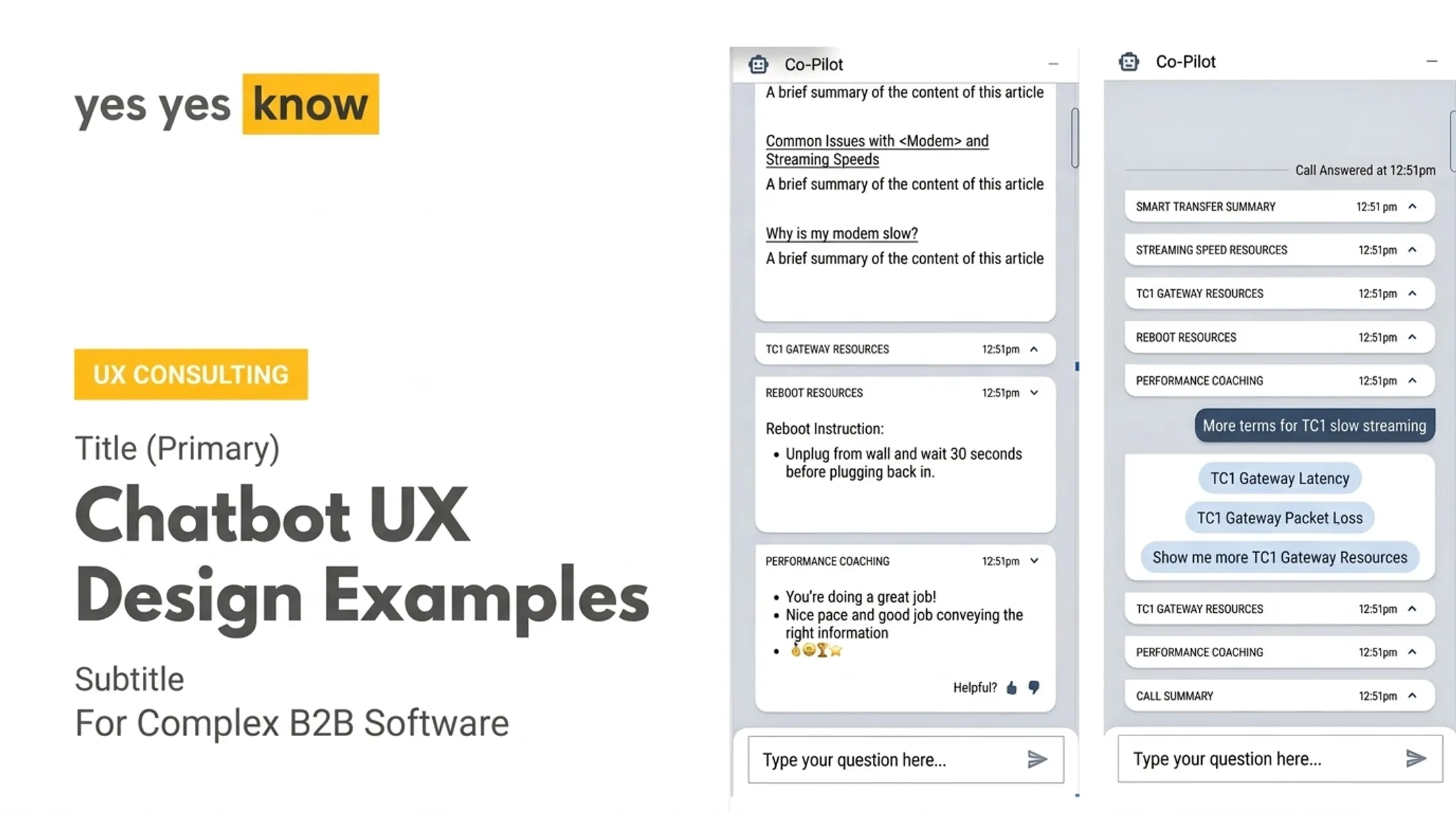
One internal case study tested this directly. A Figma prototype simulated an AI copilot for customer service agents, with real-time suggestions during live calls. The team ran a Wizard of Oz test (a human secretly triggered pre-written responses) before writing any backend code.
Three roles drove the session: a customer service agent, a customer played by the "wizard," and a moderator. The finding stuck: agent-generated content should stay visually distinct from what the user authored, yet remain editable, so people can collaborate without losing ownership of the work.
Design Trust, Transparency, and Safe Recovery
Trust doesn't come from confidence-sounding copy. It comes from being able to check the agent's work without digging through logs.
Microsoft's design guidance for agent-based products calls for ways to see and control agent actions directly, including dashboards, settings, and logs that support supervision rather than just command issuance. That framing is useful: the interface's job is to make oversight easy, not optional.
Match the Trust Mechanism to the Concern
Different tasks need different proof:
- Citations for research outputs
- Diffs for code or content changes
- Previews for generated interfaces
- Source spans for summaries
- Approval checkpoints for consequential actions
Show concise tool-call summaries with affected records or files, plus expandable details for anyone who wants to dig deeper. Avoid presenting a hidden chain-of-thought as the default explanation — a running commentary of raw reasoning is not the same as a clear account of what happened and why.
Design for the Moments When Things Break
Uncertainty and error states deserve as much design attention as the happy path:
- State what failed in plain language
- Show what remains unchanged
- Spell out what the agent needs from the user
- Indicate whether retrying is safe
Trust breaks fast. In copilot research on live support calls, a single weak or off-topic suggestion early on caused human agents to tune the assistant out for the rest of the interaction. More alerts were not the answer; fewer, better ones were. Those users preferred one meaningful, actionable suggestion every few minutes over a constant stream of reactive noise.

Make actions reversible wherever possible:
- Version history and draft states
- Rollback and undo
- Recovery from interrupted runs
Then test trust with scenarios that actually break things:
- Ambiguous prompts and incorrect tool results
- Permission failures and conflicting data
- Partial completion and agents that hit a dead end
Build Accessibility Into the Agent Experience
Dynamic agent interfaces raise accessibility requirements that go well beyond static page compliance. Content updates while a user is looking at it. Something needs to tell them what changed without knocking them off course.
WCAG 2.2's Success Criterion 4.1.3 addresses this directly, requiring that status messages be programmatically determinable so assistive technology can announce them without stealing keyboard focus. That's not a nice-to-have for agent UIs. It's the difference between a screen reader user knowing a task finished and sitting there wondering if anything happened at all.
Build these in from the start:
- Keyboard access with visible, logically ordered focus
- Screen-reader announcements for status changes
- Accessible names for dynamically generated controls
- Non-visual alternatives for charts, previews, and rich outputs
- Clear language, predictable status labels, and progressive disclosure
Users also need to review, edit, approve, stop, and undo agent actions without relying on drag-and-drop, color alone, or timed interactions. If a control only works with a mouse, it doesn't work for everyone.
This is where accessibility and usability testing overlap directly. Yes Yes Know's accessibility audits combine automated tools with manual testing, screen readers, and keyboard-navigation review, evaluated against WCAG 2.2 AA — the same standard relevant to agent interfaces that update dynamically.
Validating with people with disabilities and assistive technologies isn't a compliance checkbox; it's how teams catch the gaps that automated scans miss entirely.
Prototype, Evaluate, and Implement the Agent UI
Skip the polished screens at first. Start with low-fidelity journey maps and service blueprints that show user intent, agent decisions, tool calls, approval points, failures, and final outcomes.
Test Before You Build
Use the Wizard of Oz method early. In one engagement, scripted role-play and a Figma prototype—no NLP models, no backend—validated an AI copilot's usefulness, tone, and timing before any code existed. Trust signals and failure points showed up while they were still cheap to fix.

Prototype several interaction models and test which one actually supports the task:
- Chat-plus-artifact — best when users explore, compare, and leave with a draft or deliverable
- Plan-plus-workspace — fits multi-step operational work where the agent proposes and the user steers
- Dashboard-plus-approval-queue — suits high-volume review where humans clear or reject agent output
Evaluate With Real Criteria
Score prototypes against concrete criteria:
- Task success and time-to-completion
- Comprehension, correction, and recovery paths
- Accessibility and user confidence
- Signs of inappropriate automation
Skip simulated-only runs. Usability feedback has to come from people working in real contexts.
Choose the technical approach only after the behavior model is clear. Each option has different security and maintainability tradeoffs:
- Static, developer-controlled UI
- Structured declarative components
- Flexible generated UI
Implementation choices stick better when UX and engineering align early—less rework, fewer late surprises.
After launch, watch failed runs, repeated corrections, abandoned tasks, accessibility barriers, and places users override the agent. Those signals show where to refine both the agent and the interface around it.
Frequently Asked Questions
Which AI agent is best for UI design?
It depends on the output you need. v0 and Lovable generate editable interfaces, Cursor reviews AI code through diffs, and Google Stitch exports designs to Figma. None of them replaces human design and validation.
What is agent UI used for?
Agent UI helps users instruct, supervise, inspect, approve, edit, and recover from AI systems performing multi-step tasks or producing structured outputs. It's the layer that keeps a person accountable for actions the system takes on their behalf.
What are the big 4 AI agents?
There's no universally accepted "big four." Categories and leading products vary by context and use case. Compare tools, autonomy, safety, and fit for your workflow instead of relying on a fixed list.
How do you design a good AI agent UI?
Define clear task scope, show visible progress, and build in meaningful checkpoints. Make actions inspectable and reversible, keep controls accessible, and test with realistic failure scenarios, not just the happy path.
How can you make an AI agent UI trustworthy and accessible?
Trust comes from transparent actions, evidence, permissions, uncertainty states, and recovery paths. Accessibility requires keyboard and assistive-technology support, understandable status updates, and testing with people with disabilities and real assistive technology.