Effective data visualization UI design isn't just about picking attractive charts. It’s a careful blend of information architecture, interaction design, data literacy, and deep product context. A great data UI empowers users by making complex information digestible and actionable.
This guide will walk you through the core components of designing effective data visualization interfaces. We’ll define what a data UI is, cover essential design principles, outline a practical workflow, and explore the critical roles of accessibility and interface states.
Key Takeaways
- Anchor the UI on a specific user decision or task, not every available metric.
- Align chart choice, hierarchy, labels, and interaction to cut interpretation effort.
- Research real users to learn what they monitor, compare, investigate, and act on.
- Design loading, empty, partial, and error states as core parts of the experience.
- Build accessibility beyond contrast: text alternatives, keyboard access, and clear semantics.
What does data visualization UI design mean?
A data visualization UI is the interface layer through which people view, filter, compare, explore, and act on data. It’s the visible, interactive part of the system—the dashboards, charts, and tables—not the underlying database, analytics engine, or data pipeline that powers it.
Unlike a static chart in a report, a data visualization UI is dynamic. It often includes:
- Dashboards with multiple related metrics
- Interactive tables that can be sorted and filtered
- Controls for drilling down into specific segments
- Annotations and alerts that flag important events
- Contextual explanations and definitions
The goal is to directly support user activities. A security analyst might use a dashboard to find an anomaly, a marketing manager might compare campaign performance across segments, and an operations leader might monitor a key performance indicator (KPI) in real time.
For B2B and enterprise products, the stakes are higher. These interfaces must account for complex workflows, multiple user roles with different permissions, and domain-specific terminology. A confusing design can lead to costly errors.
For example, our work with Lakeside, a B2B software company, began because they had "a ton of AI data" but no clear picture of how to present it. The same dataset can be either a source of clarity or a wall of confusion depending on its design.
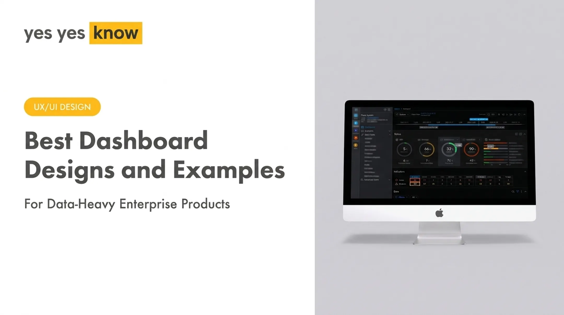
A dashboard that presents system status metrics of 5%, 66%, and 90% alongside tables of "36 severe alarms" becomes useful only when the UI provides the hierarchy and context to act on that information.

Principles of effective data visualization UI design
A well-designed data interface feels intuitive when it rests on clear principles. It anticipates what users need, cuts cognitive load, and supports confident decisions.
Start with the user’s question and decision
Before choosing a chart type, identify what the user needs to know. What question are they answering? How fast do they need the answer? What action follows the insight?
A 2024 experiment on dashboard cognitive load shows that representation shapes perception and adoption. The design has to match the user’s task.
Create a clear visual hierarchy
Avoid giving every metric the same visual weight. A successful dashboard guides the user's attention.
- Primary KPIs: Place the numbers that drive decisions first and largest.
- Supporting trends: Use secondary charts to explain movement behind those KPIs.
- Warnings and alerts: Signal critical issues with color, icons, and placement—not equal weight with routine metrics.
- Detailed records: Keep tables and deep views reachable without crowding the first screen.
In the Lakeside dashboard, for instance, high-level status metrics are presented at the top, while tables with severe and moderate alarms are separated to create a clear path from overview to detail.
Match visualization types to analytical tasks
The right chart depends on the question the user is asking. While there are no absolute rules, some pairings work better than others:
- Category comparison: Bar charts share a baseline, so magnitude gaps are easy to judge.
- Trend over time: Line charts make the pattern of change readable at a glance.
- Frequency distribution: A histogram shows how values cluster across ranges.
- Relationship between measures: A scatterplot surfaces correlation between two variables.
- Parts of a whole: Simple bars usually beat pie or donut charts when users need to compare composition.
Sometimes, a simple table is the most effective visualization, especially when users need to look up exact values, scan rows, or sort data by different columns. The ThreatX API Catalog we helped design combined a donut chart for an overview with detailed inventory tables that users could filter and export.
Provide context that prevents misinterpretation
Data without context is easily misunderstood. Always include elements that help users interpret what they're seeing correctly:
- Clear titles and labels for every chart and axis
- Units of measurement (such as $, %, or ms)
- The time range the data covers
- Baselines or targets for comparison
- A timestamp for when the data was last updated
- Visible filters that show what is included or excluded
Design for progressive disclosure
Show a clear overview first, then let users go deeper. Don’t surface every filter and control at once—reveal detail through interaction.
Useful patterns include:
- Tooltips on hover for point-level values
- Clickable chart elements that open a drill-down
- Filters that appear only when the task needs them
That keeps the primary view clean and still gives a direct path to deeper analysis.
A practical process for designing a data visualization interface
Creating a data visualization UI is an iterative process grounded in research, prototyping, and validation. A structured workflow keeps the final design useful, usable, and technically feasible.
Begin with research and product discovery. Map user roles, domain knowledge, existing workflows, and pain points. User interviews, task analysis, and a review of current analytics show what people actually need from the data before any charts are chosen.
Define the information and interaction model. Before sketching charts, document key metrics, relationships, and interactions: required filters, data states (loading, empty, error), and paths from overview to detailed investigation. This model becomes the UI blueprint.
Create a content and chart inventory. Map each business question to a metric, visualization type, and interaction. The inventory clarifies every on-screen element and flags redundant, low-value, or ambiguous metrics to cut.
Prototype at multiple levels of fidelity. Start with low-fidelity wireframes for layout and hierarchy, then build interactive prototypes that cover filtering, sorting, drill-down, and error recovery. Test the full flow before engineering begins.
Test prototypes with representative users. Give realistic tasks and watch whether users find the right information, interpret it correctly, and take the next action. A 2019 study of an enterprise clinical dashboard found users often missed filter changes or struggled to reset them—strong reason to test those interactions explicitly.
Validate with product and engineering partners. Review the design with the technical team before lock-in. Confirm data availability, query performance, update frequency, and implementation constraints so the UI is buildable and maintainable—not only usable.

If the product is already in market, a UX audit is a practical entry point: it surfaces confusing workflows and ranks fixes before a full redesign. Yes Yes Know audits core user flows and delivers a severity-rated report with actionable recommendations, often within two weeks.
Accessibility and interface states in data visualization UI
An effective data UI works for everyone—and that only happens when accessibility and interface states are designed in from the start, not patched on later.
Accessibility is more than color
Communicating information only through color excludes users with color vision deficiencies. The Web Content Accessibility Guidelines (WCAG) require that color is never the only way you convey meaning.
- Pair color with patterns, symbols, position, or text labels so series stay distinct without hue alone
- Keep text and key graphical elements (chart lines, markers) at sufficient contrast against the background
- Make filters, drill-downs, and other controls fully keyboard-operable
- Give charts accessible names, and offer a text or table alternative for complex views that screen readers can announce
At Yes Yes Know, founder Jen Bullard—CPACC certified through the International Association of Accessibility Professionals—leads an approach that builds accessibility into research and design from day one, not as a late-stage fix.
Plan for all interface states
Data is rarely perfect or instantaneous. A robust UI accounts for this by designing for various states:

- Loading: Show a progress indicator so users know the system is working—never a “no results” message while data is still fetching
- Empty: When a query truly returns nothing, say so clearly and explain why
- Partial: Flag incomplete data so users do not treat a partial set as the full picture
- Error: Explain what failed and offer a concrete next step
Well-designed states build trust by showing what the system is doing, why the user is seeing this view, and what they can do next.
Common data visualization UI mistakes and how to evaluate the design
Even strong teams ship data interfaces that confuse users. Spotting these failure patterns early makes design reviews faster and more objective.
Common failures include:
- Overloading a dashboard with dozens of metrics and no clear hierarchy
- Choosing chart types for aesthetic appeal instead of clarity
- Using the wrong chart for the job (for example, a pie chart to show a trend over time)
- Hiding units or active filters so users must guess what a number means
- Mixing scales across similar charts so visual comparison fails
- Shipping a "data dump" dashboard with no primary user task
Poor interaction feedback also creates uncertainty. The interface should always provide visible loading progress, clear confirmation when a filter is applied, and recoverable error messages.
How to evaluate your design
To evaluate the effectiveness of your data visualization UI, go beyond a simple visual review.
- Task-based usability testing — Ask users to find a metric, explain what it means, compare the right values, and take the next step.
- Accessibility checks — Test keyboard-only navigation and screen readers, and verify color contrast.
- Content and terminology review — Confirm labels, abbreviations, and definitions are clear to your audience.
- Visual hierarchy review — Check that the layout pulls attention to the most important information first.
- Technical checks — Run realistic data volumes and complex filter combinations to validate performance.
If users can complete core analysis tasks without help, the visualization UI is doing its job—regardless of how polished it looks in a static review.
Frequently Asked Questions
What is a data UI?
A data UI is the interactive interface (the charts, tables, and filters) that people use to view, interpret, explore, and act on data. It is the user-facing layer, separate from the underlying database or analytics engine.
How do I choose the right chart for a data visualization UI?
Chart choice should follow the user’s question. Use bar charts for comparing values, line charts for showing change over time, scatterplots for exploring relationships, and histograms for revealing a distribution.
What makes a dashboard easy to use?
An easy-to-use dashboard has a clear visual hierarchy, shows only relevant metrics, and uses understandable labels. It also features consistent interactions, provides helpful context, and is designed to support the user’s primary tasks.
How can I make data visualizations accessible?
Communicate meaning with more than just color by using patterns, symbols, and text labels. Ensure sufficient contrast, provide full keyboard access to all controls, and offer text or table alternatives for complex charts.
Should data dashboards include tables as well as charts?
Yes, tables are excellent for supporting tasks that require looking up exact values, scanning and sorting line items, or exporting data. While charts help users see patterns, tables provide the underlying detail and an accessible alternative.
Why should loading and error states be designed for data visualizations?
Incomplete or delayed data can lead to incorrect interpretations and erode user trust. Designing clear states for loading, empty results, and errors communicates system status, explains what’s happening, and provides recovery actions.